






All of my web projects are built in Webflow, where I am a certified professional partner.

Atlas Strategic Advisors
A landing page for people to learn about their team and services. It’s main goal was to make the small team look professional.
Pictou County Volunteer Ground Search and Rescue
A digital home base for PCVGSAR to recruit volunteers and donations to keep supporting the vulnerable in their community.
Burin Efficiency Units
Nightly rentals located in my hometown. The website is for people to find contact information and see our family run business offerings.
The Ledge
Boutique cabins for nightly rental. The website is for people to find contact information and directions.
Logy Bay Development Association
Local development association who was looking for a place to share information easily with their community.
Growler Energy
Local renewable energy developer looking to display their corporate values and completed projects online.
Rock Disability Management
Workplace disability management provider looking to display their services online.
Tacora Resources Sustainability Progress
Large iron ore mine who was looking for an easier and quicker way to share updates publically than their annual sustainabiltiy report.
Drive Electric NL
Digital hub for Newfoundland’s first electric vehicle information hub to encourage people to buy EVs.
St. John’s Pride
Local pride organization. Lots of integrations from merch store, events calendar, resources library, etc.
Graze ‘n Thyme
Now defunct made to order charcuterie board boxes. Was designed to accept payments in person and online.
Orogen Technologies
Now defunct SaaS operating and selling digital products to mines and geologists.
Irma Gerd Store
Now defunct quick turn around merch store for a local drag artist who starred on Crave’s Canada’s Drag Race.
SEM Ltd.
Local Indigenous environmental consulting firm.
Anthony Brenton Store
Online store and portfolio for him to sell prints of his paintings on. Eventually growing to include his band’s music as well.
Cody Watkins Photography
Custom building a portfolio to showcase his nature photography. Eventually, a store will be added to purchase prints from a local printer.
Vitality Kinetics Alliance
Online only physiotherapy and injury rehabilitation provider. Integration to take bookings is at the heart of the website.
Jacob Manning’s Portfolio
Custom building a portfolio to showcase the work he’s currently doing with the Government of Nova Scotia.
Design in Action
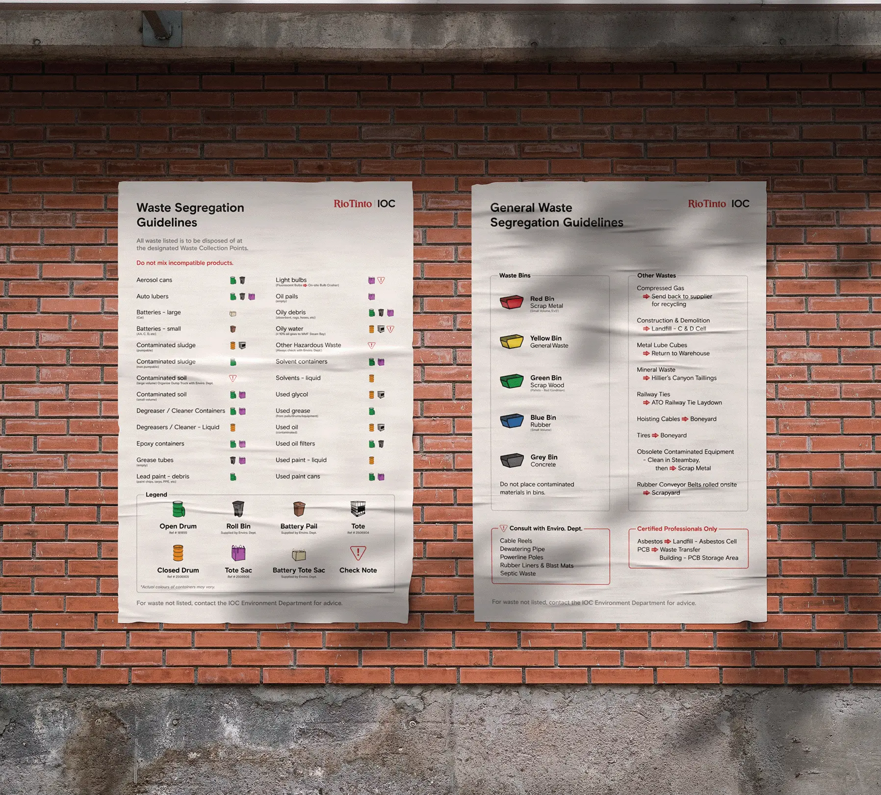
I talk a lot about how design ≠ art and there should be a purpose behind every decision made. To visualize this better, I want to walk you over this design that lead to increased safety and a shift in process for IOC through the creation of their waste management posters.
Their Environmental Department came to SEM Ltd. with a complicated excel document of different waste types including glass, contaminated waste, recyclables and more, and their corresponding safe methods of disposal.
By organizing the data, colour coding the directions for safe disposal, and creating icons that mirrored the associated container, I was able to create clear easy to follow directions.
The posters created have led to safer waste disposal across IOC’s entire mine site.